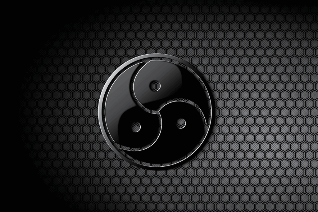
Logo BDSM
Definition
The BDSM logo is the international symbol of the BDSM community. It consists of a circle divided into three parts by a curved, twisting symbol reminiscent of a spinning triangle or the Ying Yang symbol. There is a dot in each of the three fields. The design is derived from the traditional triskelion (or triskele), an ancient symbol representing movement, power, and cyclical energy.

Explanation of the logo
The BDSM logo was designed in 1998 by American designer Quagmyr, with the intention of creating a discreet but recognizable symbol that BDSM practitioners could use without immediately evoking sexual connotations. The logo has a black and gray color scheme and is often rendered in metal or leather texture. Its appearance seems abstract to outsiders, while insiders immediately recognize its meaning.
The circle symbolizes unity and connectedness within the community, but also the closed nature that often characterizes BDSM: what happens within the circle stays within the circle. The three sections with points represent the three main components of BDSM: Bondage & Discipline, Dominance & Submission, and Sadism & Masochism. Another interpretation sees the three points as representing the core principles of Safe, Sane & Consensual.
The logo is not associated with any one movement, but represents the entire BDSM culture, regardless of gender, orientation, or preference. You can find it on jewelry, flags, websites, stickers, tattoos, and key rings. Some wear it visibly as a sign of pride or recognition, while others wear it discreetly to show their connection. It has become the global symbol of respectful, conscious, and consensual BDSM.
Safety & points of attention
Although the BDSM logo is a symbol of pride and identity, it deserves respect in its use. It is not a brand or commercial logo, but a common symbol of a subculture that values mutual consent and discretion.
Related terms logo
More information

